Thursday, 30 October 2014

Music Magazine Photography Planning

Professional Photo Shoot - Planning Sheet
The music magazine that I currently have in mind is one specializing in the rock/indie genres.
I think my house style should have complimentary colors, for example “blue and orange” to attract the potential audience. The color blue implies a cold, masculine connotation, hinting at my primary target audience of teen-aged/young adult males. The color orange will make the font stand out and compliment the blue background.
It should create the impression of being a moody but stylized magazine to re-enforce the indie/rock genre featured.
What to Photograph
What techniques to use
How I achieve this
A character shot of the main band member to go on the front cover.
No direct mode of address to make the band member seen mysterious/disinterested.
Mid shot
Low lighting to create atmosphere

Appropriate model
Lighting correctly set up
Costume to fit genre


A shot of all band members to feature in one the articles.
Direct mode of address to engage the audience
Low angle shot to make the band members seem dominant and in control
A barren field or industrial building for the background to create atmosphere and re-enforce connotations
Appropriate model/s
Make sure weather/time of location is appropriate
Costumes to fit genre
Appropriate location

A shot of one of the band members playing a musical instrument.
No direct mode of address to show band member is fully engaged in playing.
Low lighting to create atmosphere
Mid shot to show band member and instrument.
Appropriate model
Appropriate pose
Appropriate prop
Lighting set up correctly
Costume to fit genre


I will need models, a location, lighting studio, props and professional camera.

Tuesday, 21 October 2014

College Magazine Progress

Before working on my music magazine, I have decided to make a college magazine to develop my understanding of Photoshop and InDesign.


This is the first draft of my magazine. I have decided on the name The Prior Preview as the alliteration creates flow and links in with the College theme. The photo I chose for the background was used as it the winding path creates a welcoming impression, further re-enforced by the image of me smiling. The typography I have chosen suggests professionalism and formality, it presents the college in a suitable manner. The background image I have chosen in the contents page was used as the pillars create a rule of three, with the walls on the left and right sides. This allowed me to easily separate the contents page into three segments. I edited the image in Photoshop the contents text to be seen clearer. However, this proved to be unsuccessful. The articles featured link to my audience questionnaire as there are articles relating media and clubs available at Prior.


This is the second draft of my magazine.The masthead has been recolored and Contents Header to further fit Prior's house style and the image of me has been edited in Photoshop using the "auto colour" tool to make me blend into the background more and look less "grey" as I did in previous images. The background image has been edited to compliment the text and look more attractive.  
.
This is the third draft of my magazine. I have added a plug which states "First Ever Issue!" to attract an audience as it suggests importance. The plug has been edited on Photoshop using the shape, text, and gradient tool. 

This the fourth and final draft of my magazine. Conventions such as a barcode and price have been added to give my magazine a more professional look. The content's font has been recolored to stand out more against the background and more text has been added to remove dead space. One of the images has been relocated to again remove dead space and to make the contents look more appealing.


 Overall I think that for my first time using InDesign, my draft magazine has been successful. I have most of the conventions found in my research to create a magazine for a specific  audience (in this case College Students) whilst organizing them in a way that creates a professional and neat layout. Images have been edited to make them more visually appealing.


Friday, 17 October 2014

Music Magazine Research

NME


New Music Express is a British weekly magazine that has been published since 1953. It is largely associated with the rock, indie and alternative music genres. It was originally a music newspaper, until it moved into a magazine format in the 1980s, changing from newsprint in 1998. It was one of the first magazines to introduce a singles chart and during the 1970s it was the bestselling British music newspaper. An online version of NME was launched in 1996, and with over 7 million users on it per month it is the world’s biggest standalone music website. According to http://www.nrs.co.uk/latest-results/nrs-print-results/general-magazines-nrsprintresults/ over 198,000 people purchase NME regularly. The magazine obviously has the primary audience as Indie music fans and a secondary audience of teenagers, judging by the grungy, informal image the magazine conveys


NME magazines usually feature a house style of white and red. This shows brand identity as the audience can tell what the magazine they are after just by colour scheme alone.  Direct mode of address is used on most of the magazine covers, as a featured band/band member on the coverlines is usually looking at the audience. The masthead is located in the top left corner of magazine suggesting unimportance; this could reflect how NME specialises in the indie scene which is not typically well known. Most pages feature an extract from an interview with the featured band. This attracts an audience as we are interested in gossip and other people’s lives and implies what content is in the magazine. Also importance to note is that the typography on the band’s names are larger than the title of the magazine itself – suggesting that the band is more important than the magazine. This implies that NME uses the bands to attract a wide audience as possible. Those who are, for example, MUSE fans are more likely to buy a NME magazine featuring MUSE on the front cover than one with the “Black Keys” on it. On most of the magazine covers, above the masthead are names of other bands, again implying content and attracting a potential audience.


The contents pages also share a similar colour scheme, and each use a similar layout. The page has a band index in the left column, allowing for easy navigation of the contents within the magazine. There is usually an image located in the middle of the page with a short article below it, linking it to the text. The magazine has a subscription form at the middle-bottom of it, immediately giving the audience the option to subscribe. On the right are the contents itself, separated into columns depending on whether they are reviews, features etc. 


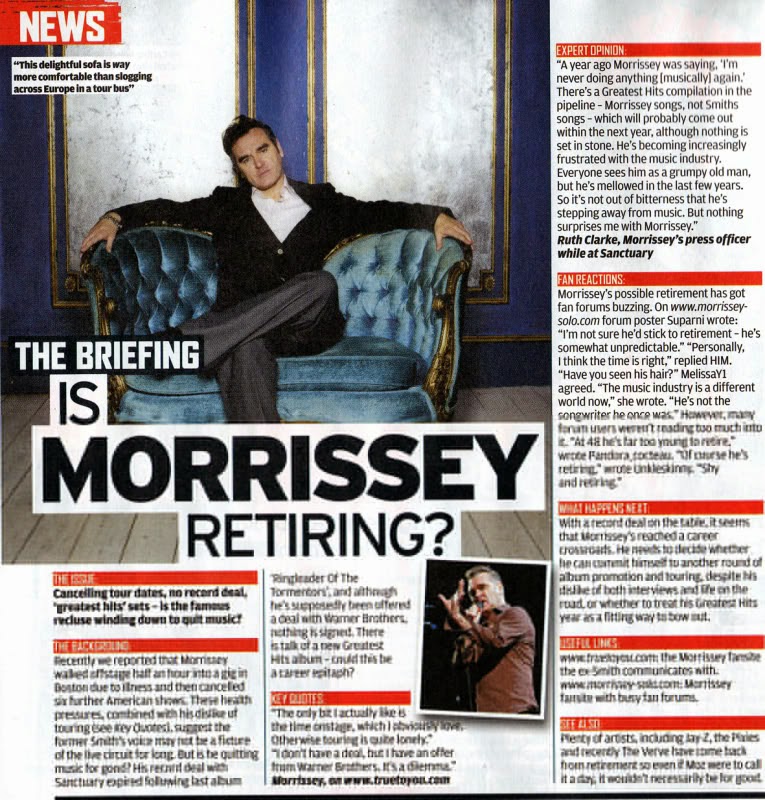
The typography of the headlines are bold and highlighted, this makes it so the audience’s attention is brought directly towards it. The highlights are normally coloured red to reflect the colour scheme NME magazine has. The colour used contrast with the main image, this way the audience’s attention is brought to both the image and article. Text is usually placed at either side of the magazine, with the image on the other, this makes the article easier to read and navigate. The image usually re-enforces the headline of the article. The image in the headline “The Teenagers” connotates the messy, carefree, rebellious stereotype that young adults have. Another example would be “Is Morrissey Retiring?” the image shows Morrissey on a comfy chair relaxed. 

Similar magazines that focus on the indie music scene are Q and INDIE, however NME is the more popular option and focuses more on the rock sub-genre, leading to a small rivalry with rock magazines such as Kerrang. The Rolling Stones magazine also has some competition with NME as they are both popular music magazines.
  NME has been featured on News sites such as the guardian (http://www.theguardian.com/media) with articles as recent as the 7th October 2014, showing how the magazine is still relevant today. However, one article has mentioned that viewing figures of the magazine have been declining. This could be however due to the fact the convergent nature of media has made magazine articles feature more prominently on the internet. The magazine has recently tried to appeal to a larger female audience and focus on more mainstream artists in order to get a wider aduidence
One of the most controversial writers in NME was Steve Wells, (http://www.theguardian.com/media/organgrinder/2009/jun/25/nme-writer-steven-wells-tribute-james-brown) who reportedly “Had little interest in music”. Steve wrote articles featuring new bands that he had only recently discovered, but his clever writing and sense of humour made him popular with readers and co-workers alike


Magazine Convnetions PowerPoint


Tuesday, 14 October 2014

College Magazine Planning


College Magazine Planning

Before I design my college magazine I need to consider planning aspects of it. This will help the design process as it will be much quicker and focused and allow me to have the best end result.

Possible Magazine Names

  • The Prior Preview
  • Prior to Prior
  • Where the College Things Are
  • The Fresher’s Find

How many pages the magazine will be

I am estimating about 20-45 pages for the college magazine. As there are many subjects and events at Prior Pursglove College there are many articles and features I could do. Judging from my questionnaire many of my participants took media and/or subjects relating to arts, so to attract a wide audience I should include some articles involving those subjects. They also are participating in some clubs so I could also do a feature on what clubs are on offer.

Possible Content

  • Advertisements (2 pages)
  • Features ( 10 pages)
  • Articles (5-10 pages)
  • Information on Subjects (10 pages)
  • News (2 pages)
  • Student interaction (1 page)
  • Other (Cartoons/FAQ) (5 pages)

Ideas

An introduction to Prior – What to expect for the next two years

Courses A-Z – From Animal Care to Science

Clubs at Prior – Interested in Anime or Debating?

A look at the Gym – Bench Pressing Business

Prior’s lunch menu (possible advertisement?) – What’s for Lunch?

Your First Week at Prior – Students tell us their stories

Supervised Study – How does it help?

Photoshop Tutorial – For all your media needs!

Comic Strip – College Cartoons

Halloween Competition – Spooky Scary Skeletons


Colour Schemes

As Prior Pursglove College already has a colour scheme of purple and white, it is most likely that my magazine will keep the same house style for consistency. However, purple and white isn’t the most eye-catching colour scheme, so if I want my audience to be attracted to the magazine it will need a much more vivid colour scheme.

  • Blue and Orange (Contrasts)
  • White and Purple (Follows house style)
  • Black and Yellow (Contrasts)
  • Pink and Blue (Compliments)